FOURTH PLAIN FORWARD
Lockup | Identity | Styleguide | Social Media
The International District in Vancouver, WA is a thriving multicultural neighborhood filled with successful shops, restaurants, unique events, and activities. It is safe and inviting to visitors and the families that work and play here. Fourth Plain Forward contributes to the blossoming of this district’s foundation through hosting events in the park, taking part in urban design conversations, and partnering with other community-based organizations.
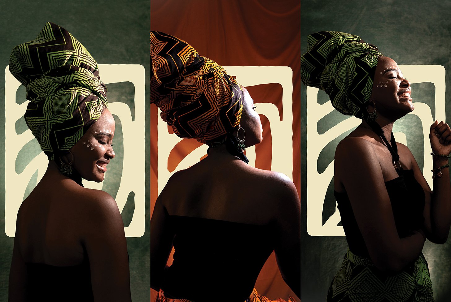
The visual brand harnesses the idea of growth and nourishment of Fourth Plain’s community members, protected by strengthening local business and providing opportunities for connection. This notion is at the forefront of every touchpoint.
Fourth Plain Commons, the building that Fourth Plain Forward’s office resides. Building design and render by © Salazar Architect Inc.
We designed a set of unique icons that showcase what makes the Fourth Plain Corridor special: the organic environment, local businesses, local events, and community resources. The brand’s pattern continues the idea of growth and connection.
The brand’s font called Larken, contains forms that resemble nature: its ebbs, flows, and subtle stark curvature. Larken’s large family allows for typographic variation to keep the brand feeling fresh.
“Thank you for your great work! I’ve been constantly blown away by your creativity and dedication to getting the work done, you are a great team to work with”
— Paul Burgess, Executive Director at Fourth Plain Forward


